Ownership?
Whenever I am researching a subject while reading a book, it is easy to understand that the book is the work of a particular author, but when I am searching through the web for the same or similar information/material, the question of authorship often becomes somewhat murky. Respecting the work of others and protecting your own work in an age of plentiful information found on the web is a question that often causes me some anxiety that I might not give proper credit to an author.
How can this be avoided? Does it mean one must constantly redefine the thin line that lies between knowledge that can be considered general understanding, or common knowledge, and that of enfringement or plagiarism?
I believe that one way of evaluating what is proper and acceptable when using information found on the web is through understanding the laws that apply to web use. An excellent resource can be found in the U.S. Copyright Office website, which explains how items in print and items in electronic media are treated, with regards to legal issues.
Abbreviations?
Another element of good writing is the proper use of the the correct abbreviations for a particular word or phrase. Latin was not a major subject of mine, and what little I know and use comes from courses I have taken in the health sciences, but I do know that when the wrong phrase is used or the wrong abbreviations is placed in a sentence, it can act like a set of screeching brakes by interrupting the reader's flow of thought.
So I offer for you another useful site that I found that can be used as a guideline to correct abbreviations - and that site led me to another blog that serves as an acronym finder.
Sunday, December 20, 2009
Friday, December 11, 2009
beginnings and endings
During my research process for a recent project on the usefulness of social media tools, I uncovered a great deal of writing and opinion on the transition of blogging, from its origin as a form of social connection in limited special-interest groups, to its present day incarnation, as an integral part of information exchange for both personal and business use.
So, I began to wonder. What is the nature of blogging? Can I look at blogging as an evolutionary form of communication, one created in the human consciousness because of the easy availability of technology, which allows the human mind to explore new possibilities aloud? Or is it a form of retroactive response to the natural flow that is our lives, giving us a much needed outlet to re-hash and process these same events into meaningful interpretations through our blogs?
As a new blogger, still trying to find my own personal style and "public voice" I was stuck by the words of Thomas Griffith, a former police reporter who rose to become the senior editor at Time magazine, who said "Journalism is in fact history on the run," Griffith went on to explain: "It is history written in time to be acted upon: thereby not only recording events but at times influencing them. Journalism is also the recording of history while the facts are not all in."
Although I am aware of the current debate as to whether bloggers are actual journalists or simply amateur writers responding to stories through the lens of their own perspectives, I choose to think that they are indeed journalists, each with a unique expressiveness on their own self-selected topics.
For example, taking this blog as an illustration of that point, I can review my posts over the last few months and see the historical progression of my ideas and understanding grow on the different subjects I have studied, and this growth has been made possible through the discussions I have had with you, the reader. Writing is a form of self expression but it also a process of learning for the writer, with each word building new ideas and each design selected to express a certain tone.
Let's go back to the historical beginning of my blog so I can try to explain what I mean. In starting this blog, I spent a few anxious hours thinking anout the title of this blog, as I wanted it to be unique and yet express my determination to accomplish something that I wasn't very keen on doing.
It just so happened that my husband and I were watching a Little League World Series game, at the same time I was setting up my outline and looking at various designs for the blog. I kept trying different titles but none seemed quite right, and then I heard an announcer describe a player on one of the teams as a kid who just keeps on "plowing the river." I thought he was referring to a kid who just hit a line drive, right past everyone, up the middle of the field, but my husband thought he was referring to the sheer energy of the kid who was pitching at the time. (My husband based his belief on the fact that the announcer for that game was Orel Hershiser, a former pitcher. I based my belief on my own preferred interpretation, so my husband was probably right on that one. )
But no matter who was correct, I decided I liked that title, and that I was pretty sure that I had heard that statement or a similar one used before, so I went to my friends Google, Bing and Ask to see if I could find the original quote. I found that river boat captains used that phrase to describe difficult journeys when they had to pilot their boats to break through obstacles and junk to find their way through (an appropriate description of my mindset, at the time) and I found a similar statement by Simon Bolivar, who said "Whosoever works for a revolution is plowing the sea" a statement born out of his frustration in his fight for independence. As I considere myself a fighter for the independence of new ideas, this too, felt appropriate.
I share that story with you to illustrate that this is when I began to reach my first understanding of how any blog, even my blog, can be used to maintain an allegiance to discovery of truth and tribute to the past, as a way of creating new directions of meaning for the future; made possible by using the experiences of ourselves and others to share meaning that is filtered through our own interpretations.
Continuing my exploration of my blogging style by reading through old posts, I can see that in my earlier posts, my writing was more formal and distant, and I believe this grows out of my natural reluctance to relinquish my privacy by revealing personal information in my blog. I still think that there should not be very much of that in a blog that is designed to look more outwardly than inwardly for new discoveries in areas associated with technical communication.
Continuing to read from the beginning of my blog, I also note several changes in design as I read through each new post, along with a growing comfort using new media tools to insert text, html, create style changes and adjust the appearance of the blog. As I move into more recent postings, my blogging style has become less formal in some posts, at times even dipping into over-casualness with the reader. I am not sure I want to do that too much, so I will have to remember to monitor that tendency.
In summary, I was reluctant to begin blogging because I thought that it would take time away from my learning process and reveal too much of what makes me - well - be me, to the outside world. But, what I discovered is that it has added to my learning process, and has instead revealed more of myself to me.
Up until a few weeks ago, I thought that I would probably abandon this blog as being too time-consuming, but after making these self-discoveries, I am rethinking that idea. After all, if I found out this much in the past three months, who knows what I could discover in the future?
Projects and Research and Work
I recently completed an exhaustive but very interesting research and evaluation of a project that involved pitching a proposal to another company on the topic of social media market expansion. At the end of this post, I would like to present a short copy of the basic research proposal I wrote for XYZ, Inc. and I would appreciate any comment or suggestions on how to improve it.
But first, let's talk a little about the development process of a project. I have always loved research and I have to admit, it is my favorite part of any project . And, I thought I knew a fair amount about social medial applications and website trafficking, but allow me to just share with you a little of what I learned during the last few weeks.
I learned that there are so many social media tools, applications and sites that it is virtually impossible to keep track of all of them. Do you doubt me? Take a look at some screen shots from a really interesting site called Web 2.0 Tools and Applications, found at Go2Web20.net
OBJECTIVES
ASSESSMENT
The primary measurement of the success of my proposal will be evidenced by the successful reformulation of defero as a leader in new B2B AND B2C social media design technologies, which can be easily measured by the number of new customers XYZ, Inc., acquires through this reformulation.
PERSONNEL
.
Item
Explanation
Cost
One laptop PC (Sony Vaio)
16.4 inch, 2.53 GH Intel Core Duo, 4GB RAM, 320 GB hard drive, ATI graphics,
$1,200*
Audio & Video Software
Adobe Flash Media Interactive Server 3.5 upgrade
$400.00
External microphones (2)
Sennheiser MKH 416 P 48 U 3 – microphone with built-in filters and cable
$1,199*
Office expenses
Paper delivery of proposals, adaptations, tracking expenses.
$200
Traveling expenses
Fuel and mileage for travel within the greater New York-New Jersey for implementation of services
$500
Additional podcasts and deliverables
Any podcasts and/or other deliverables that are not included in the original proposal will be negotiated at contract rates
*
Total expenses
$3,100*
TIMELINE
But first, let's talk a little about the development process of a project. I have always loved research and I have to admit, it is my favorite part of any project . And, I thought I knew a fair amount about social medial applications and website trafficking, but allow me to just share with you a little of what I learned during the last few weeks.
I learned that there are so many social media tools, applications and sites that it is virtually impossible to keep track of all of them. Do you doubt me? Take a look at some screen shots from a really interesting site called Web 2.0 Tools and Applications, found at Go2Web20.net

Pretty cool, huh? I spent way too much time on just this one site playing a game with myself, by trying to see how many sites or icons I recognized, and if I didn't recognize them, whether or not I could guess what they were Well, man, I was twelve pages deep into this game before I realized that there were another 54 pages to go!
I think that just that one site really brought home to me how vast and how fast social media outlets are developing and changing.
Another interesting thing that was fully confirmed for me during my research was the realization that each of these technologies have a personality, a style all of their own, and in my proposal development, I started to think about how to fit the right tool to the right person or company in order to promote the type of image that is desired. I think I might take up that challenge in a later post and try to define as many of the social media tools that I can in terms of image and really, in terms of their own branding strategies.

Other interesting facts that I discovered during my during my proposal development process were some great examples of the power of social media technologies to influence marketing and brand appeal.
Of course, I thought I knew that the right comination of tools would bring traffic and exposure to a site but take a look at the following video, see what you think of it, and then I will share something with you that I found amazing:
After viewing a youtube of Will it Blend with an iphone as target of the blender, social media news aggregators and sharing networks have had over 100,000,000 hits on that video - That's right, one hundred million. It became so popular that iPhone even now has an app for Will It Blend?
According to a interview on the subject with Ben Wills, social media networking alone drove the website traffic to Will it Blend up 650% as a result of the traffic generated by the hits to the video.
Watch the Cool Interview about the impact of social media...
Now, let us shift back to the topic of constructing effective proposals. What I found confusing about the proposal writing process was all of the advice I found that warned against being too specific in social media proposals. The reasoning behind it seems to be that prospective clients are not necessarily interested in hiring social media consultants and instead seem to be more focused on having the consultant give them free strategies that they then make their own.
So, I tried to do maintain a general tone in my proposal but found myself conflicted, as it felt as though I was keeping the outline too general; so I am concerned that a prospective client would not have a clear enough picture of the strategy I was proposing. Please take a look at an abbreviated version of my proposal design and see which position you would take -
XYZ Proposal
Presented by
Phoebe Del Boccio
New Visions Partnerships
BACKGROUND
OBJECTIVES
My goal is to help XYZ, Inc. reformulate their image from that of an established media presence into a fresh new image, as a producer of new media approaches for companies seeking to take advantage of the Web 2.0 social media strategies, as these strategies have rapidly become an integral part of the way in which business is conducted today. To this aim, I seek funding for the development of a customized business strategy that will allow defero to achieve its objectives of generating new business and establishing the company as a leader in this field.
PLAN
My plan will be distributed through the use of podcasting technologies embedded within a website to allow for a visual and auditory connection with the ideas being presented. Please continue to http://www.xyzxyz.com/ to view and experience the presentation for this proposal.
HARDWARE/SOFTWARE
ASSESSMENT
The primary measurement of the success of my proposal will be evidenced by the successful reformulation of defero as a leader in new B2B AND B2C social media design technologies, which can be easily measured by the number of new customers XYZ, Inc., acquires through this reformulation.
PERSONNEL
I will record the implementation program and conduct interviews with the officers and with the technical and support staff of defero in order to select which specific tools will best serve XYZ, Inc., in the successful realization of the new strategies presented in this proposal. I will continue to develop training and strategy reinforcement podcasts as needed throughout the development and implementation of the performance strategy to ensure compliance with, and understanding of, the goals that defero intends to achieve.
BUDGET
.
Item
Explanation
Cost
One laptop PC (Sony Vaio)
16.4 inch, 2.53 GH Intel Core Duo, 4GB RAM, 320 GB hard drive, ATI graphics,
$1,200*
Audio & Video Software
Adobe Flash Media Interactive Server 3.5 upgrade
$400.00
External microphones (2)
Sennheiser MKH 416 P 48 U 3 – microphone with built-in filters and cable
$1,199*
Office expenses
Paper delivery of proposals, adaptations, tracking expenses.
$200
Traveling expenses
Fuel and mileage for travel within the greater New York-New Jersey for implementation of services
$500
Additional podcasts and deliverables
Any podcasts and/or other deliverables that are not included in the original proposal will be negotiated at contract rates
*
Total expenses
$3,100*
TIMELINE
After our contract for services is completed, I can start the initial interview and analysis stage of my proposal immediately. This process is expected to take two weeks to one month for completion, and is dependent upon the availability and schedules of your SME’s in management, technical and support staffing.
After phase one is completed, the assessment of needs report and the development of the podcasting strategies (and any additional agreed upon work) is expected to take two – three weeks. Training and support provided to XYZ, Inc., by New Visions Partnerships during the strategy implementation phase will take two weeks per 50 employees.
CONCLUSION
I am confident that your vision and my expertise can bring XYZ, Inc. into the forefront of technology strategy leaders in the Web 2.0 business world. I look forward to working with you in this venture and helping you to realize your goals. If you have need of any information not contained in this proposal or if you have questions that pertain to this proposal, please feel free to contact me via the telephone numbers of email addresses that are provided in my curriculum vitae.
REFERENCES
Sunday, December 6, 2009
Project Collaboration
When considering the topic of collaboration in the workplace, and before I try to evaluate my own recent personal experience with collaboration, I found an interesting video that helped me form a framework for exactly what effective collaboration should be. I hope you enjoy it and find it as useful for contextualization as I did.
Collaborate/ collaboration... The more I think about this word, the more I like it. According to Merriam Webster, the word collaboration comes from the Latin word collaborare meaning "to labor together," and has three common meanings:
1 : to work jointly with others or together especially in an intellectual endeavor
2 : to cooperate with or willingly assist an enemy of one's country and especially an occupying force
3 : to cooperate with an agency or instrumentality with which one is not immediately connected.
Although the second definition is not very positive, numbers 1 and 3 definitions are just beautiful, aren't they? Thinking about collaboration as an evolutionary desirable trait, we can recognize how every successful country/government/movement or organization depends upon collaboration to bring people together in order to more easily and effectively accomplish a shared goal.
In fact, history and popular culture are full of expressions which reflect our views about collaboration, or the lack thereof. Consider the expression attributed to the English dramatist, John Heywood - "Many hands make light work," or the contradictory common saying "Too many cooks spoil the broth." When reflecting about my recent experiences with teamwork and collaboration on various projects, I believe it is fair to say that I experienced varying degrees of interaction with my team members on many of our projects, ranging from frustrating to enlightenment.
For example, Steve and I tried to work out a collaborative arrangement via email exchanges on podcasting for a start-up venture, but due to time constraints and individual workloads, we were unable to successfully complete our ideas. In the glossary contributions, the items submitted by many of our colleagues inspired me to look for and find complementary ideas that I found to be personally compelling, so I suppose you could say that the glossary contributions led to an indirect collaboration through shared ideas.
The same holds true for my writeboard and co-ment experiences, as I was able to read and respond to the many ideas and writings of my colleagues. I found that their thoughts and comments inspired me to explore different avenues than the ones I may have chosen of my own volition.
As for the scheduled chat sessions, I was not able to take advantage of any of them due to my work schedule, which is, admittedly, a disadvantage for me in this program. I am required to perform varied hours shift work, and often work 10 and 12 hours days, frequently until 11pm or 12 am. In each section of this program, including this segment, the preferred meeting time for chats chosen by the majority always seems to be around 7-730 pm, which keeps me from participating in the chats. Even when I try to work around it, my work schedule is too unpredictable to allow for equal participation in projects with my colleagues via chat.
In another instance of attempted collaboration, Lauren was kind enough to give several of us invites to Google Wave, an online collaboration tool, and we tried to set up a time for several of us to get together to create a commentary that we could use in this project, but even though I timed it to use my break-time at work, I was unable to load the site using my blackberry, and we are not allowed to use the work computers for personal reasons, so Lauren and Isao were able to work without my contributions. (See our initial attempts, examples below)

The one area where I felt we were able to collaborate effectively, albeit asynchronously, was in the forums, where we were able to share discoveries, ask questions and receive clarification from each other on many topics. I always feel that collaboration is worthwhile, because when working with others, each endeavor is as unique as the individuals involved, and shared work often develops organically from the contributions of the team. I would welcome the opportunity to fully develop a project using an interactive teamwork environment, where the team could create the project and modify it from start to finish. I am looking forward to the final project that develops from our joint contributions, because after all, human agency depends upon collaboration, and provides such rich rewards that it is doubtful whether people could have survived without it.
In summary, collaboration is a vital part of our lives, from both a personal perspective and a professional one, and although most of us would like to believe that we alone are the masters of our own destinies, the truth of the matter is that we depend upon the collaborative work of others from the moment we are born until the moment we die. Nearly every act we are capable of has been possible because of the work of others, and nearly everything we do is for the agency of others as well. The better collaborators we become, the more successfully we navigate our way through life.
Sunday, November 29, 2009
Eye Tracking for Usability
Introduction
Eye tracking is a process that describes where a person’s gaze focuses and how their eyes and head move in corresponding motion, and it is used to measure exactly what a person’s gaze focuses on and the length of time the gaze stays fixated on the object. Formal observations of eye tracking movements are generally believed to have been around for at least 100 years.
In various histories of ophtalmology, common knowledge states that the investigation of eye movements was first formally studied as far back as the late 1800’s by the renowned ophthalmologist Louis Emile Javal, who first noted the rapid stops or “fixations” of the eye when reading and the "saccades" or fast movement of the eyes from object to object.
This discovery was followed
by the development
of various mechanical
devices and visual aids
that were designed to
measure eye movement
and head position during
the
performance of visual tasks.
We will come back to Javal's "fixations" later in this article, but let us first look at why eye tracking gives the modern designer an important tool in design technology.
Why study Eye Tracking?
The study of eye tracking has added to our knowledge of the mechanisms of visual perception in many fields, including advances in the areas of:
medicine
language
psychology
neurology
advertising
design
In Lynne Cooke's excellent article on Eye Tracking:How It Works and How It Relates to Usability, Lynne explains how eye tracking is used to measure factors of usability in readers of print media, as eye tracking has shown that the readers tend to read text in groups of words rather than process each word seperately, often skipping the third word of a sentence and letting their brain fill in the meaning based on the overall context.
What can we learn about usability from eye-tracking?
A key factor of eye tracking is its ability to help the designer measure immersion or attachment to an object. In the Poynter Institute's "EyeTrack III" 2004 Eye Tracking Study researchers noted that Javal's "fixations" , the resting of the eye on a particular object are "are most commonly measured according to duration and frequency," and "typically last between 250 and 500 milliseconds." This is an important factor in both measuring and understanding how eye tracking works.
In television and movies, eye tracking has been used to measure where the eyes of the viewer focus during movement and whether that movement translates into acceptance or attachment of the message being advertised. An excellent example of this is seen in the following Dove anti-conformity video message regarding modern conceptions of beauty. The advertisement has been eye- tracked by ThinkEyeTrack using heat mapping technology:
How is eye-tracking being used for web and user interface design?
Eye tracking can be used to structure web design by helping the designer understand the responses of the target audience. As the Poynter Institute report showed, information taken from usability analyses done with eye tracking technology found that designers could more easily measure whether a design was successful in attracting attention by considering the following data points:
F-Pattern Heat Map

Eye movements roughly tended to follow the "F"and the "Z" pattern of design.
Small type encouraged focused reading behavior while large type promoted light scanning.
Underlined headlines discouraged reading of related information underneath the headline.
Short paragraphs were preferred over long paragraphs.
Headlines accompanied by summary descriptions were popular,with a majority of people viewing all or part of the story.
Images of at least 210 X 230 pixels received more eye traffic than smaller images, and people frequentlyclicked on the 210 X 230 pixel images.
For a practical demonstration of how web design can be improved for usability with eye-tracking technology, take a look at this demonstration of creating an effective design for an online banking customer using statistical analysis reports that were derived from eye tracking analyses.
In this post I have tried to use some of the principles I learned while studying eye tracking usability, such as constructing the text to match typical heat mapping patterns, using short paragraphs, varying the size of the text, using bolded titles, bullet lists and visual assists to help the reader engage with the article. Can you tell me if you found it effective?
Eye tracking is a process that describes where a person’s gaze focuses and how their eyes and head move in corresponding motion, and it is used to measure exactly what a person’s gaze focuses on and the length of time the gaze stays fixated on the object. Formal observations of eye tracking movements are generally believed to have been around for at least 100 years.
In various histories of ophtalmology, common knowledge states that the investigation of eye movements was first formally studied as far back as the late 1800’s by the renowned ophthalmologist Louis Emile Javal, who first noted the rapid stops or “fixations” of the eye when reading and the "saccades" or fast movement of the eyes from object to object.
This discovery was followed
by the development
of various mechanical
devices and visual aids
that were designed to
measure eye movement
and head position during
the
performance of visual tasks.
We will come back to Javal's "fixations" later in this article, but let us first look at why eye tracking gives the modern designer an important tool in design technology.
Why study Eye Tracking?
The study of eye tracking has added to our knowledge of the mechanisms of visual perception in many fields, including advances in the areas of:
In Lynne Cooke's excellent article on Eye Tracking:How It Works and How It Relates to Usability, Lynne explains how eye tracking is used to measure factors of usability in readers of print media, as eye tracking has shown that the readers tend to read text in groups of words rather than process each word seperately, often skipping the third word of a sentence and letting their brain fill in the meaning based on the overall context.
What can we learn about usability from eye-tracking?
A key factor of eye tracking is its ability to help the designer measure immersion or attachment to an object. In the Poynter Institute's "EyeTrack III" 2004 Eye Tracking Study researchers noted that Javal's "fixations" , the resting of the eye on a particular object are "are most commonly measured according to duration and frequency," and "typically last between 250 and 500 milliseconds." This is an important factor in both measuring and understanding how eye tracking works.
In television and movies, eye tracking has been used to measure where the eyes of the viewer focus during movement and whether that movement translates into acceptance or attachment of the message being advertised. An excellent example of this is seen in the following Dove anti-conformity video message regarding modern conceptions of beauty. The advertisement has been eye- tracked by ThinkEyeTrack using heat mapping technology:
How is eye-tracking being used for web and user interface design?
Eye tracking can be used to structure web design by helping the designer understand the responses of the target audience. As the Poynter Institute report showed, information taken from usability analyses done with eye tracking technology found that designers could more easily measure whether a design was successful in attracting attention by considering the following data points:
F-Pattern Heat Map
Eye movements roughly tended to follow the "F"and the "Z" pattern of design.
Small type encouraged focused reading behavior while large type promoted light scanning.
Underlined headlines discouraged reading of related information underneath the headline.
Short paragraphs were preferred over long paragraphs.
Headlines accompanied by summary descriptions were popular,with a majority of people viewing all or part of the story.
Images of at least 210 X 230 pixels received more eye traffic than smaller images, and people frequentlyclicked on the 210 X 230 pixel images.
For a practical demonstration of how web design can be improved for usability with eye-tracking technology, take a look at this demonstration of creating an effective design for an online banking customer using statistical analysis reports that were derived from eye tracking analyses.
In this post I have tried to use some of the principles I learned while studying eye tracking usability, such as constructing the text to match typical heat mapping patterns, using short paragraphs, varying the size of the text, using bolded titles, bullet lists and visual assists to help the reader engage with the article. Can you tell me if you found it effective?
Saturday, November 21, 2009
Blog Development
What does it take to become a blogger?
I created this blog during the last week of August and named it Plowing the River. The title was intended to suggest a journey of discovery and progression in technical communications, specifically in writing and design elements. Wow, I had no idea how prophetic the theme of the blog would turn out to be! I often felt as if I were really plowing a frozen river, only to have the ice reform as soon as I broke through, especially when trying to learn how to apply a new app or gadget - but then, there were also days of smooth sailing when things worked, and new discoveries were made.
I would like to take you through a little of my developmental growing pains, and I will try to recapture some of what I found interesting about my posting assignments and design process, using screen shots, videos and commentary. Let's start with the first task of the process where the goal was to create a blog, and pick a template. I sorted through dozens of pre-made templates, in Blogger and throughout the web, before I settled on the Rounders 3 template, which I chose mostly because of the color scheme. Prior to beginning this blog, I had very little blogging experience, having created my first blog as a class assignment last semester using a blog site that contained little room for design issues. I did enjoy the discovery process of finding topics that matched the subject, but I felt silly actually publishing them because they were so obviously the work of a neophyte. I found the process of writing my first post for this blog to be both interesting and a little awkward at the same time, perhaps because it is hard to find your "voice" as a novice blogger. I don't think I was very effective in defining a mission statement, simply because I wasn't sure what direction the blog would take me or how well I could steer it. But, onward! Original blog design September 1, 2009
In between the actual writing of the posts, I continued to play around with layout and design and discovered that a great deal of the enjoyment of reading depends on a useful and appealing layout, although I believe it is possible that novice bloggers might get too caught up in the physical aspect of blogging, and lose sight of the point of blogging to communicate. Blog Redesign #4
I created this blog during the last week of August and named it Plowing the River. The title was intended to suggest a journey of discovery and progression in technical communications, specifically in writing and design elements. Wow, I had no idea how prophetic the theme of the blog would turn out to be! I often felt as if I were really plowing a frozen river, only to have the ice reform as soon as I broke through, especially when trying to learn how to apply a new app or gadget - but then, there were also days of smooth sailing when things worked, and new discoveries were made.
I would like to take you through a little of my developmental growing pains, and I will try to recapture some of what I found interesting about my posting assignments and design process, using screen shots, videos and commentary. Let's start with the first task of the process where the goal was to create a blog, and pick a template. I sorted through dozens of pre-made templates, in Blogger and throughout the web, before I settled on the Rounders 3 template, which I chose mostly because of the color scheme. Prior to beginning this blog, I had very little blogging experience, having created my first blog as a class assignment last semester using a blog site that contained little room for design issues. I did enjoy the discovery process of finding topics that matched the subject, but I felt silly actually publishing them because they were so obviously the work of a neophyte. I found the process of writing my first post for this blog to be both interesting and a little awkward at the same time, perhaps because it is hard to find your "voice" as a novice blogger. I don't think I was very effective in defining a mission statement, simply because I wasn't sure what direction the blog would take me or how well I could steer it. But, onward! Original blog design September 1, 2009


In between the actual writing of the posts, I continued to play around with layout and design and discovered that a great deal of the enjoyment of reading depends on a useful and appealing layout, although I believe it is possible that novice bloggers might get too caught up in the physical aspect of blogging, and lose sight of the point of blogging to communicate. Blog Redesign #4

The next assignment allowed me to get into the more technical aspects of typeface, and learn how to evaluate and choose types for specific tasks. During the next month, I was able to complete posts on the emergence and future development of Web 2.0, and Social Bookmarking using Delicious, a social bookmarking tool. The Web 2.0 assignment helped me to start to think of future technologies beyond the present day, and how to encourage my workplace to start to avail themselves of the new media.
Blog Redesign #5

Learning to use Delicious was fun, and I felt like I was really beginning to appreciate the opportunity to learn hands-on application of the tools I was incorporating into my blog. I also enjoyed seeing how some of my followers were developing their blogs, and became braver in my own as a result of their efforts. As for the design aspect of my blogging venture, I kept experimenting with design, color and typography changes and read the opinions of my colleagues and others on the web about the virtues or horrors of left column vs. right column reading, bold vs. italics, etc.
Blog Redesign #6

Over the next few weeks, I was able to blog about the Power of Imagery,(one of my favorite topics), and perform an analysis of a website I had designed (ai!,Quelle horreur!) which certainly cemented my annoyance at being unable to create the design the way I would have preferred because of a lack of familiarity with the necessary tools, but that is a Fixable Element...to the future>
Blog Redesign # 7

The website design and review for the last two assignments was based on learning styles assessment, and those assignments gave me a better understanding of how people who are interested in technical communication and design have to maintain an awareness of their preferences, their strengths and weaknesses in order to better serve their clients and audiences.
Blog Redesign # 8

My last two tasks have been to write about how eye-tracking applies to usability issues, (another assignment I loved) and to try to understand my development as a blogger. During this last week, I have changed the site back to a wide format with a very minimal use of color or fuss, even though I understand that syle is not the most popular, simply because it looks cleaner and easier to follow, at least to me. I am pleased to report that I was able to create and place my own logo on my blogsite, as well as my first flash banner, yeah! As a final view for this week, I've included a sample of my present site, with sidebar and a video of the flash action in the banner.
Blog Redesign #9 Sidebar

Blog redesign #9

After completing this review, I am able to understand that blogging is an evolving, organic, continuous process of learning and development, both as a writer and as a designer. Althoug I have prior experience in the technical aspects of computer science, most of that was behind the scenes, and I was not very comfortable with the public presence that a successful blog requires.
I feel much easier in my blogging "skin" than I did at the beginning of the semester and this blog has inspired me to improve my other class blogs, as well. I would have to rate my Plowing The River blog as a very positive growth experience.
Tuesday, November 3, 2009
Analysis of website design
I recently completed a website design for a non-profit volunteer agency that provides health services to underfunded communities, while using that platform of services to promote greater health literacy in each community. My site was developed using a framework that was created to appeal to a group of people who have a particular learning style. The learning style design that I used was based on the results of a completed Index of Learning Styles questionaire that measured the test takers preferences on four dimensions: active / reflective, sensing / intuitive, visual / verbal, and sequential/global. Here is a screenshot of the particular learning style that I used to design the website:

As you can see based on the results of the testing, I had to consider a user who was very strongly oriented towards the intuitive and global learning styles, with a relatively even balance of visual and verbal learning styles. The user also scored moderately higher in favor of an active learning style over that of a reflective learning style.
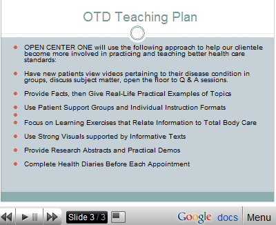
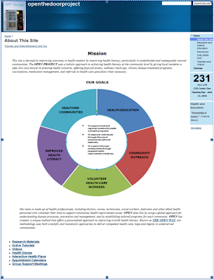
What this means, according to the ILS developers, Richard M. Felder, Linda K. Silverman, and Barbara A. Soloman of North Carolina State University, is that my design should be designed to appeal to users who learn in the following manner: Due to their higher scorees on global and intuitive processing, their positive score on active learning versus reflective learning and their equal use of visual and verbal learning styles, my users are thus more capable of learning by doing, of interacting directly with the any information or material that is presented to them. They can do this through hands-on experience, discussion, or by teaching or explaining the relevant concepts to others. In my site development for my project, I included a plan to have the users of my proposed services work in groups, discuss the material under review with the lecturers who were presenting the information, as well as with with other group members in support groups. I developed a plan to have the staff present the information using research and factual data that then is related to real-life situations in order to make concrete examples of the ideas under discussion:
(See the lay-out for the teaching plan that is developed for active learners who learn using visual and text-based information)>
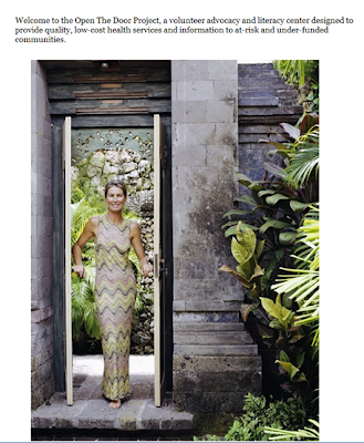
Because my target audience has an almost equal ability to learn using visual and written material, I tried to evenly distribute the information that I was presenting using both styles in my design. Throughout my site development process, I tried different layouts and constructs to appeal to my core audience, such as pictures of healthy, vibrant people who promote the idea of health and wellness. One of my earlier designs used the title of my company "OPEN THE DOOR" to better health, with a visual of a woman walking through a doorway to reinforce this idea on an intuitive level: See image>
After review, however, I felt that my audience would respond better to real-life people who are already involved in improving the lives of themselves and others through promoting better health, rather than to a woman who looks as though she is walking out of a spa, so I changed that page of my site to include bicyclists riding up a hill and a picture of a respected colleague, Natasha, a clinical scientist who is dedicated to creating better health care outcomes for others, and who is also interested in developing the OPEN project in concrete form>
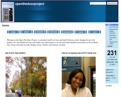
On the Learning styles test, my target audience also scored higher on intuitive and global learning style preferences, indicating that they will learn more effectively using a "big-picture" approach towards understanding a concept versus a step-by-step method. Because intuitive learners enjoy the use of novel and innovative approaches to learning, rather than the "tried and true" techniques that involve repetition and rote learning, so I designed the entire website using a global, intuitive format, achieved (hopefully) by including descriptions of the project on each page of the design, by providing several pages of supporting information on health care issues to allow the users to develop a view of the issues in totality. By giving the users the overall concept of the program, before listing specific services, I felt that they would get a better grasp of what the center hopes to accomplish with its work.
See an early example and a finished screen-shot from the website>
Early Version: Final Version:

Another element I included in my design was the use of videos and tutorials to reinforce particularly important lessons. This type of format should be useful to a group who needs a global overview of a problem, who learn intuitively, and allow the viewer to stop, rewind, and review the videos and tutorials until they have absorbed the lesson. Here is an screen-shot from my video page:
Trying to incorporate specific learning preferences into a consolidated web design was an interesting experience, although it felt a little awkward at first. In considering a design not as what I find personally appealing, but rather from the potential appeal to a particular audience, I really found that I liked structuring a solution to problem in this way. Using learning styles as focal points help to add structure to the thought process during the development of a website. I developed most of my site content off-line before I started playing with the visual design of the site. I tried many themes, versions, layouts and data structures before I settled on the final version, which consists of a basic blue and white color scheme. In designing the site, my intenton was to present the information I wanted to convey in a way that would allow the reader to intuitively grasp the interlinked concepts, rather than leading the reader through a step-by-step description. To give you, the reader, an idea of the visual effect of my site, please see the pages below, presented in sequence:


I hoped you have enjoyed this process review. I would really like to know how all styles of learners feel about my site design and content, what you like, dislike, things you find effective or ineffective, etc. Please feel free to share your thoughts! My finished site can be seen and enjoyed in its entirety at:
OPEN THE DOOR: To Better Health.

As you can see based on the results of the testing, I had to consider a user who was very strongly oriented towards the intuitive and global learning styles, with a relatively even balance of visual and verbal learning styles. The user also scored moderately higher in favor of an active learning style over that of a reflective learning style.
What this means, according to the ILS developers, Richard M. Felder, Linda K. Silverman, and Barbara A. Soloman of North Carolina State University, is that my design should be designed to appeal to users who learn in the following manner: Due to their higher scorees on global and intuitive processing, their positive score on active learning versus reflective learning and their equal use of visual and verbal learning styles, my users are thus more capable of learning by doing, of interacting directly with the any information or material that is presented to them. They can do this through hands-on experience, discussion, or by teaching or explaining the relevant concepts to others. In my site development for my project, I included a plan to have the users of my proposed services work in groups, discuss the material under review with the lecturers who were presenting the information, as well as with with other group members in support groups. I developed a plan to have the staff present the information using research and factual data that then is related to real-life situations in order to make concrete examples of the ideas under discussion:
(See the lay-out for the teaching plan that is developed for active learners who learn using visual and text-based information)>

Because my target audience has an almost equal ability to learn using visual and written material, I tried to evenly distribute the information that I was presenting using both styles in my design. Throughout my site development process, I tried different layouts and constructs to appeal to my core audience, such as pictures of healthy, vibrant people who promote the idea of health and wellness. One of my earlier designs used the title of my company "OPEN THE DOOR" to better health, with a visual of a woman walking through a doorway to reinforce this idea on an intuitive level: See image>

After review, however, I felt that my audience would respond better to real-life people who are already involved in improving the lives of themselves and others through promoting better health, rather than to a woman who looks as though she is walking out of a spa, so I changed that page of my site to include bicyclists riding up a hill and a picture of a respected colleague, Natasha, a clinical scientist who is dedicated to creating better health care outcomes for others, and who is also interested in developing the OPEN project in concrete form>

On the Learning styles test, my target audience also scored higher on intuitive and global learning style preferences, indicating that they will learn more effectively using a "big-picture" approach towards understanding a concept versus a step-by-step method. Because intuitive learners enjoy the use of novel and innovative approaches to learning, rather than the "tried and true" techniques that involve repetition and rote learning, so I designed the entire website using a global, intuitive format, achieved (hopefully) by including descriptions of the project on each page of the design, by providing several pages of supporting information on health care issues to allow the users to develop a view of the issues in totality. By giving the users the overall concept of the program, before listing specific services, I felt that they would get a better grasp of what the center hopes to accomplish with its work.
See an early example and a finished screen-shot from the website>
Early Version: Final Version:


Another element I included in my design was the use of videos and tutorials to reinforce particularly important lessons. This type of format should be useful to a group who needs a global overview of a problem, who learn intuitively, and allow the viewer to stop, rewind, and review the videos and tutorials until they have absorbed the lesson. Here is an screen-shot from my video page:

Trying to incorporate specific learning preferences into a consolidated web design was an interesting experience, although it felt a little awkward at first. In considering a design not as what I find personally appealing, but rather from the potential appeal to a particular audience, I really found that I liked structuring a solution to problem in this way. Using learning styles as focal points help to add structure to the thought process during the development of a website. I developed most of my site content off-line before I started playing with the visual design of the site. I tried many themes, versions, layouts and data structures before I settled on the final version, which consists of a basic blue and white color scheme. In designing the site, my intenton was to present the information I wanted to convey in a way that would allow the reader to intuitively grasp the interlinked concepts, rather than leading the reader through a step-by-step description. To give you, the reader, an idea of the visual effect of my site, please see the pages below, presented in sequence:


I hoped you have enjoyed this process review. I would really like to know how all styles of learners feel about my site design and content, what you like, dislike, things you find effective or ineffective, etc. Please feel free to share your thoughts! My finished site can be seen and enjoyed in its entirety at:
OPEN THE DOOR: To Better Health.
Wednesday, October 28, 2009
The Power of Imagery
In keeping with the spirit of this blog, and while trying to understand the importance of images versus words in visual design, I took a little journey in search of the perfect site to conduct my own analysis. I started with websites designed by musicians, thinking that there might be more interesting illustrations and visual content in musical sites as compared to say, a government-run website. So, I looked at an artist that I like and found a home site for the artist on My Space
-
Although I liked the subliminal messages implied by the representational use of the Brooklyn Bridge, (Brooklyn = real, gritty, but cool) I wasn't sure if a MySpace account was really authentic web design, so I did a search for the best musical artist website and I found an article Wikipedia article that told me there was a MTV Video Music Award for Best Artist Website design given out only one time, in 1999, to the musical group Red Hot Chili Peppers.


While the present website for the Red Hot Chili Peppers has a very interesting minimalist representational style, using a spotlight that focuses on a roll of film, it uses only three links as navigation to the pages titled: Drive-In, News and Log-In. Although the Drive-In link takes the viewer to a few additional navigational pages, such as the Stadium Arcadium (their 9th album) page, I still didn't feel as if this site provided enough contrast for an interesting analytical exercise.
So, I returned to my original idea for comparison, the government agency website. Admittedly, I had certain assumptions about government-run sites, namely that the text would overpower the visuals and that a greater use of text over visuals = boring website. Sure enough, this assumption proved to be true on the first site I looked at; the IRS home page.

This IRS site is primarily text-based with very little visual content, or useful icons. The navigation was easily accomplished, but the site itself was very tedious to navigate, with the eyes of the viewer having no particular point of focus. Tell the truth - the IRS site makes you want to either escape quickly or go to sleep, right?
So, in search of a better example, I left this site and traveled into outer-space , courtesy of NASA. Wow, what a site! This site has everything - an almost equal blend of representational and informational material, including interactive learning tools, artist's renderings and beautiful photography, videos, charts, iPhone applications, Twitter feeds, and over 40 NASA blogs!

The NASA site has very effective visual imagery, including icons that use the symbols of the actual object to lead to more detail via icon links, such as a shuttle icon that takes you to the history of shuttle mission, information about the shuttles, etc.; 
The wayfinding and navigation on this site is probably the most impressive aspect of the NASA design, with a seemingly endless selection of links to NASA information. After spending over one hour on the site, I counted over 500 active pages and icons. I could easily spend an entire day
just exploring this site!
During this process of site analysis, I did learn several new things: some of the content analysis would be obvious to anyone - for example, how the tremendous power of the visual content on the NASA site engages the viewer, and makes you want to continue to explore, in contrast to the IRS site. But other lessons were more intuitively processed: the use of the heavy text without visual leads made the navigation of the IRS site difficult, with no clear wayfinding process illustrated.
The heavy text also made my eyes tire more quickly, and I quickly lost interest in trying to find new pages, as the end result of using this wayfinding felt more like a chore. In contrast, the NASA site did not feel tedious at all; in fact, it felt like an adventure of discovery.The very effective use of the latest technologies made the NASA site appear fresh, but formal, savvy without immaturity. In the NASA site navigation, you almost feel as if you don't need words very much with the representation material, and that the words are being used more as a crutch, but when you get into the informational material, words become more important.
Wednesday, October 21, 2009
Social Bookmarking
What Is It?
The term, social bookmarking, describes a way of collecting, sharing, organizing, and managing data on the world wide web.
Earlier generations of people created libraries by buying books, keeping or loaning the ones they liked, and organizing their collections by favorite author, topic, etc. These yesteryear book collectors spent a great deal of time and effort locating specific books and manuscripts, and once a unique item was found, it belonged to just the one collector who discovered it. Today’s electronic readers have developed a way to collect useful or desired information contained on websites and have learned how to keep their favorite information sites easily organized through the use of social bookmarking.
Similar to regular internet bookmarking in the way it allows the reader to locate and save interesting sites to their own personal computers, social bookmarking has developed an enhanced way of sharing information with others by allowing the reader to insert unique id tags into all of their searches, and allowing users to organize those searches into collections which can then easily be shared with others. In this way, simply knowing another user’s ID allows access to their collections, which creates a dynamic, ever-evolving pool of data and information.
My Journey
I recently created my own account on Delicious.com, one of the original innovators of social bookmarking, and I was pleasantly surprised by how simple it was to use and how easy it made the process of sharing data files, simply by adding another user to your list. I would like to share some of the things I observed during my Delicious odyssey.
In my virgin foray into the wilds of social bookmarking, I selected sites that are of personal interest to me in the areas of design and communication. (One particularly enjoyable piece of information concerned the difference in trichromates and tetrachromates color detection ability - See 100 Million Colors , and be sure to take the Ishara vision test!). Although the navigation was a bit disorienting at first, I gradually realized that I was trying to find sites that would provide personal illumination, rather than sites that might be of interest to others. In this way, it is easy to see how social bookmarking can serve as personal self-directed study tutorials, although the aspect of sharing is probably the most important quality social bookmarking brings to the table.
and Cons of Social Bookmarking
In my recent bookmarking experience, using Delicious was a positive experience as it allowed me to get a better idea of the popularity of various specialized sites, saved time in bookmarking sites I would like to explore in more detail and gave me a better sense of organization for my saved content.
On the more cautious side, using Delicious, and being aware that others would be able to view my bookmarks created an added awareness of the perceived value of certain of my choices, as I considered the worth of my choices as they might be perceived by others with similar interests. As I navigated the Delicious site and learned more about social bookmarking, I found myself considering the working applications of the idea behind the term folksonomy. Folksonomy, a way of tagging information with a user name or title, is both the blessing and curse of social bookmarking because it gives the user a powerful tool for organizing data without a firm structure or naming classification schema.
In his podcast on Web 2.0 for Designers, educator Ken Ronkowitz compares the folksonomy naming techniques to those used in science, but unlike the scientific principles behind taxonomy classification, folksonomies in social bookmarking have little recognizable guidelines, order or hierarchy, other than that given to each tag by individual users. This contradiction in tagging highlights the need for social bookmarking sites to adopt a modern web version of content tagging similar to the Dewey Decimal System type of classification. This could help reduce the chaos and disorder of misspelled or incompletely labeled information, at the same time that it promotes and enhances a new level of shared group communication.
This brings me to what I consider to be the most exciting aspect of social bookmarking, which is the potential it holds to become a valuable tool in building a "mega-brain" of smart data sources for personal and public use. As new content is created daily by users and added to existing information on the web, special interest groups are developing wholly original repositories of data, a veritable treasure trove of research material, scholarly writings and teachings on a myriad of subjects.
According to some sources, the enormous ancient Egyptian Library of Alexandria , known even today for the valuable contribution it made to the education of the world, grew so large because each visitor to the city was required to surrender any book or manuscript they carried over to the Royal Archives to be copied before they could resume their journey.
Social bookmarking may represent the first foundation stone in a medium that may someday assume the virtual equivalency of the ancient Library of Alexandria, in terms of the wideness of its scope and the influence it may play in the future of the virtual education of its contributors.
Library of Alexandria reproduction
Common Terms in Social Bookmarking
- A structured classification system created by a user or user group.
- A website design that uses a means of organization to manage and control data changes on the web.
- A reciprocal connection between websites.
- Keyword(s) used to that is associated with a given piece of data.
- A term used to describe web applications and sites that enable users to readily share and exchange information on the W3.

Thursday, October 15, 2009
Web 2.0
The Second Wave
Web 2.0 represents a natural evolution in the development of web technologies, a second wave in an ocean of possible usages of communication technologies which began with the creation of the original Web 1.0 format.
Developed by the innovative coming-together of user platforms containing software applications, servers, powerful databases and other tools, Web 1.0 concepts were used to process public content on the World Wide Web. As the Web 1.0 technologies began to gel and include the input of more users, these platforms led to an exceptional way of processing information. Using both recursive loops and uni-directional styles of incremental changes to produce innovative new functions, this incarnation is more popularly known as Web 2.0.
The most intriguing aspect of Web 2.0 technologies, for me, is in its similarity to the neural structures and functioning of the human brain. In the Secret Life of the Brain, scientists describe how the human brain develops neural connections in response to stimuli; the more stimuli it is exposed to, the greater is the degree of neural development. Each neuron uses synaptic links to create millions of other associations which then employ a pruning process that gets rid of infrequently used connections while strengthening the useful links. This very individualized process results in a completely unique communications network in every single human brain. I believe we are in the process of creating a giant unified brain through the constant refinement and creation of web technologies that serve as a trigger stimulus for action and reaction.
Vitamin D Video

As a means of illustrating this idea, I would like to share with you a new software application from Numenta called Vitamin D Video, an application that allows users to track and locate specific people in videos, in much the same way that the human brain is able to perform the exact same task. The website for Vitamin D video states that the software is "based on a new computing paradigm modeled after the human neocortex." As you view the Vitamin D Video demo, imagine how you would look for a friend in a crowded place and try to judge whether you thing the processes are similar.
As we continue this analysis, let's look at Wikipedia, an online encyclopedic compilation of user generated information, where we can see parallels in how the brain develops and then apply that development strategy in our use of Web 2.0. For example, one aspect of learning theory (Bandura's sociocognitive theory) says that people learn through the observation of other’s actions, and in web 1.0 that is basically what we did. We viewed the works of others in a static environment and processed that information, such as our reading of the personal websites of individuals and corporations.
In second part of the Bandura learning process, people take in information, process the information and then develop fresh ideas in response to the new concepts that were created – this is akin to how we now learn by using the interactive features of web technologies, like blogging, social networking and Wikipedia. Web 1.0 began as subject postings on various topics that were created by users, and then these postings were expandec or refined by other users until it has now evolved from a static repository of information into that of a living, ever-changing knowledge base known as Web.2.0.
How do we use Web 2.0?
One general definition of Web 2.0 technologies comes from Harvard professor Andrew McKee and is known by the acronym, SLATES. SLATES stands for: Search, Links, Authorship, Tags, Extension, Signaling, and References.
Using theis template, we can see that the key component used to identify a Web 2.0 site is its interoperability, it interactiveness between the host and the user. Today's wide use of information sharing technologies, such as social networking and video-sharing sites, have made a significant impact on the private lives of users. Once a technology gains popularity from the masses, it soon begins to make inroads into the world of business and I predict, will soon be more strongly felt in the field of education.
As we have seen since the advent of new media technologies, the general pattern of distribution occurs with the production of a product by one innovative person or company; the product is then developed through the interactive uses by the public, and then the product is expanded and promoted by the corporate world to generate profit. Once it has a foothold in the corporate world, the technology or product then tends to find its way into education and government productions.

If we accept as true that humans are flexible living beings who are always involved in a continuous procession of learning, it then follows that web technology is also part of an emergent growth cycle, therefore, Web 2.0 must already be shifting towards a new definition of possibilities.
What do the experts say about the future development of web technologies?
Tim Berners-Lee, the director of the World Wide Web Consortium (W3C) is credited with describing Web 1.0 as the read-only web, Web 2.0 as the read-write web and Web 3.0 as the read-write-execute web that may come into play in the near future. In this way, Berner-Lee emphasizes the flexibility of web technologies instead of rigid structure, and leads us to understand how the web develops by creating layers of technological advances that build upon the structures already in play.
Technical communications writer and educator Ken Ronkowitz describes Web 2.0 as “what the web is becoming,” a statement that implies the web will continue to change in response to interactive feedback from users and developers. These views support the idea of web development as an evolving, living form of intelligence in the beginning stages of development.
Technical expert and publisher Tim O’Reilly believes that the concept behind the term Web 2.0 represents a “gravitational core” of like ideas and believes that Web 2.0 is still adapting to both internal and external influences. O'Reilly discusses the future of computing as something very different from what we now understand as Web 2.0, by saying "for "Web 3.0" to be meaningful we'll need to see a serious discontinuity from the previous generation of technology." O'Reilly has developed his concept of Web 2.0 to include a "deeper understanding of the dynamics of increasing returns on the web," with the belief that "applications win if they get better the more people use them."
Tuesday, September 29, 2009
Typeface Analysis
All communications start with a need to convey information from one source to another source. Communication can be verbal, tactile and/or visual.
Visual communications can transmit messages using pictures or text. Handwritten text represents a unique creation, as the letters that make up the words are never written exactly the same way twice even when composed by the same author.
All electronically written text is created using one or more typefaces, or fonts. Encarta Dictionary defines the word "Font" as “a full set of printing type or of printed or screen characters of the same design and size.”
Font style is chosen to convey a particular type of message and type choice can have a big effect on the way an audience understands that message. To get an idea of some of the finer points of choosing a type, with a little typography history thrown into the mix, take a look at the following movie clip on Font Design:
In order to explore the topic of font style in more depth, I have selected one particular font type to focus attention on, and the font I have chosen to profile for this posting is: MONGOLIAN BAITI.

Mongolian Baiti is licensed by Microsoft Corporation and is available in Windows Vista and Windows 7.

Using Kathleen Burke Yoshida's excellent advice put forth in her publication
"Avoiding Typeface Terrors", let us take a look at Mongolian Baiti as compared to the font Tahoma in a real-life comparison of a conventional headline for an international company in the shipping industry. In this example, the company, CaroTrans, designed their website using Tahoma for the headings and sub-headings. I have provided a sample of CaroTrans' sub-heading, using Tahoma with a sample sub-heading using Mongolian Baiti:
Using this example, it is clear to see that Tahoma is a better choice for a title heading for an international company that depicts stability and strength, while Mongolian Baiti could provide good suitability and readability for the body of the text, and could easily be used with equal effect instead of a type like Arial or Times New Roman. In this example, we note that Mongolian Baiti does meet the standard definition of good legibilty, as the text is easy to read even after it is divided into top and bottom halves.
In continuing our analysis of typeface suitability, there are six important points to consider when selecting a font:
Do I use serif or sans serif type?
Is the typeface legible?
How is the readability of the font? Is it easy to read or should it only be used for dramatic effect?
What is the font's personality?
And most importantly, who is my audience and what message do I want to convey?
Serif or sans Serif - Typography experts such as Yoshida tell us that Serif type lets the reader easily follow the type across a long line of text, as it creates a baseline for the eye to follow. Mongolian Baiti is a serif style of type, making it a good choice for body text.
Legibility - How easy is it to recognize letters? - Yoshida tells us we can test legibility by placing a piece of paper over either the top or bottom half of the letters. If the text is still easy to read, the font is considered legible.

Readability - The x-height of Mongolian Baiti contains letters that have a larger body than the ascenders and descenders, making it a good choice type for easy reading, similar to Times New Roman in its versatility.
(See comparison of Times New Roman body text with Mongolian Baiti)

Personality
Yoshida tells us that a typeface's personality is related to certain characteristics of the letters,but it also depends on the subjective view of the reader. Mongolian Baiti has the feel of a understated conventional type with just a small amount of flair. The negative personality qualities of Mongolian Baiti is its lack of uniqueness and lack of distinction from other related type styles, such as Times New Roman. The positive impressions conveyed by Mongolian Baiti are the qualities of calmness, reliability, authority, and trust. Mongolian Baiti says "you can believe me - what I say in this type is true."
Compare this trustworthiness of Mongolian Baiti's personality with the typefaces of WaltDisneyScript and Candy Round BTN - Which one would you believe more?

For a humorous look behind the personalities of type, I hope you will enjoy a little type parody, as presented in the next video clip, Font Conference:
Subscribe to:
Posts (Atom)