Sunday, November 29, 2009

Eye Tracking for Usability

Introduction

Eye tracking is a process that describes where a person’s gaze focuses and how their eyes and head move in corresponding motion, and it is used to measure exactly what a person’s gaze focuses on and the length of time the gaze stays fixated on the object. Formal observations of eye tracking movements are generally believed to have been around for at least 100 years.

In various histories of ophtalmology, common knowledge states that the investigation of eye movements was first formally studied as far back as the late 1800’s by the renowned ophthalmologist Louis Emile Javal, who first noted the rapid stops or “fixations” of the eye when reading and the "saccades" or fast movement of the eyes from object to object.


This discovery was followed
by the development
of various mechanical
devices and visual aids
that were designed to
measure eye movement
and head position during
the
performance of visual tasks.
We will come back to Javal's "fixations" later in this article, but let us first look at why eye tracking gives the modern designer an important tool in design technology.


Why study Eye Tracking?

The study of eye tracking has added to our knowledge of the mechanisms of visual perception in many fields, including advances in the areas of:

  • medicine

  • language

  • psychology

  • neurology

  • advertising

  • design
    • In medicine, language, neurology and developmental psychology, eye-tracking is used to measure and explain development in social interactions,emotional responses and cognitive reasoning. Prior to the the widespead use of web technologies, eye tracking was used in design and marketing campaigns to gauge the appeal of consumer goods to targeted audiences.

      In Lynne Cooke's excellent article on Eye Tracking:How It Works and How It Relates to Usability, Lynne explains how eye tracking is used to measure factors of usability in readers of print media, as eye tracking has shown that the readers tend to read text in groups of words rather than process each word seperately, often skipping the third word of a sentence and letting their brain fill in the meaning based on the overall context.

      What can we learn about usability from eye-tracking?

      A key factor of eye tracking is its ability to help the designer measure immersion or attachment to an object. In the Poynter Institute's "EyeTrack III" 2004 Eye Tracking Study researchers noted that Javal's "fixations" , the resting of the eye on a particular object are "are most commonly measured according to duration and frequency," and "typically last between 250 and 500 milliseconds." This is an important factor in both measuring and understanding how eye tracking works.

      In television and movies, eye tracking has been used to measure where the eyes of the viewer focus during movement and whether that movement translates into acceptance or attachment of the message being advertised. An excellent example of this is seen in the following Dove anti-conformity video message regarding modern conceptions of beauty. The advertisement has been eye- tracked by ThinkEyeTrack using heat mapping technology:


      How is eye-tracking being used for web and user interface design?

      Eye tracking can be used to structure web design by helping the designer understand the responses of the target audience. As the Poynter Institute report showed, information taken from usability analyses done with eye tracking technology found that designers could more easily measure whether a design was successful in attracting attention by considering the following data points:

      F-Pattern Heat Map

      Eye movements roughly tended to follow the "F"and the "Z" pattern of design.

      Small type encouraged focused reading behavior while large type promoted light scanning.

      Underlined headlines discouraged reading of related information underneath the headline.

      Short paragraphs were preferred over long paragraphs.

      Headlines accompanied by summary descriptions were popular,with a majority of people viewing all or part of the story.

      Images of at least 210 X 230 pixels received more eye traffic than smaller images, and people frequentlyclicked on the 210 X 230 pixel images.


      For a practical demonstration of how web design can be improved for usability with eye-tracking technology, take a look at this demonstration of creating an effective design for an online banking customer using statistical analysis reports that were derived from eye tracking analyses.


      In this post I have tried to use some of the principles I learned while studying eye tracking usability, such as constructing the text to match typical heat mapping patterns, using short paragraphs, varying the size of the text, using bolded titles, bullet lists and visual assists to help the reader engage with the article. Can you tell me if you found it effective?

      Saturday, November 21, 2009

      Blog Development

      What does it take to become a blogger?

      I created this blog during the last week of August and named it Plowing the River. The title was intended to suggest a journey of discovery and progression in technical communications, specifically in writing and design elements. Wow, I had no idea how prophetic the theme of the blog would turn out to be! I often felt as if I were really plowing a frozen river, only to have the ice reform as soon as I broke through, especially when trying to learn how to apply a new app or gadget - but then, there were also days of smooth sailing when things worked, and new discoveries were made.

      I would like to take you through a little of my developmental growing pains, and I will try to recapture some of what I found interesting about my posting assignments and design process, using screen shots, videos and commentary. Let's start with the first task of the process where the goal was to create a blog, and pick a template. I sorted through dozens of pre-made templates, in Blogger and throughout the web, before I settled on the Rounders 3 template, which I chose mostly because of the color scheme. Prior to beginning this blog, I had very little blogging experience, having created my first blog as a class assignment last semester using a blog site that contained little room for design issues. I did enjoy the discovery process of finding topics that matched the subject, but I felt silly actually publishing them because they were so obviously the work of a neophyte. I found the process of writing my first post for this blog to be both interesting and a little awkward at the same time, perhaps because it is hard to find your "voice" as a novice blogger. I don't think I was very effective in defining a mission statement, simply because I wasn't sure what direction the blog would take me or how well I could steer it. But, onward! Original blog design September 1, 2009


      Next, during the first week of September I tried posting a couple of thoughts on blogging and what communication can do for our lives, and that felt pretty good, that I was able to do it and it wasn't too bad. After that little baby step, I tried to develop an analysis of the design principles used by corporate websites, and I selected a Nature site and an Adobe site for this task. I found that blogging was easier for me if i had a goal to complete, a defined task, rather than to just try to write general comments and thoughts, so I started to look at each post in terms of message. During the next two weeks, I changed "skins" or templates a couple of times, trying harbour, jellyfish and rounders 4 templates, and I added an rss blog feed, a blog archives section, and a followers gadget to my blog. Blog redesign #2


      The next two assignments I completed were a lot more fun, and helped me to start to relax a little bit during the creative process. I was able to write a post about the highly passionate subject of typography in the design world, and learned a great deal about emotion and typeface. Selcting a video to go with this post was enjoyable and added to the learning process. My next post was written to evaluate websites based on designs for specific age groups, again an enlightening exercise. Blog Design #3


      In between the actual writing of the posts, I continued to play around with layout and design and discovered that a great deal of the enjoyment of reading depends on a useful and appealing layout, although I believe it is possible that novice bloggers might get too caught up in the physical aspect of blogging, and lose sight of the point of blogging to communicate. Blog Redesign #4


      The next assignment allowed me to get into the more technical aspects of typeface, and learn how to evaluate and choose types for specific tasks. During the next month, I was able to complete posts on the emergence and future development of Web 2.0, and Social Bookmarking using Delicious, a social bookmarking tool. The Web 2.0 assignment helped me to start to think of future technologies beyond the present day, and how to encourage my workplace to start to avail themselves of the new media.
      Blog Redesign #5


      Learning to use Delicious was fun, and I felt like I was really beginning to appreciate the opportunity to learn hands-on application of the tools I was incorporating into my blog. I also enjoyed seeing how some of my followers were developing their blogs, and became braver in my own as a result of their efforts. As for the design aspect of my blogging venture, I kept experimenting with design, color and typography changes and read the opinions of my colleagues and others on the web about the virtues or horrors of left column vs. right column reading, bold vs. italics, etc.
      Blog Redesign #6


      Over the next few weeks, I was able to blog about the Power of Imagery,(one of my favorite topics), and perform an analysis of a website I had designed (ai!,Quelle horreur!) which certainly cemented my annoyance at being unable to create the design the way I would have preferred because of a lack of familiarity with the necessary tools, but that is a Fixable Element...to the future>
      Blog Redesign # 7


      The website design and review for the last two assignments was based on learning styles assessment, and those assignments gave me a better understanding of how people who are interested in technical communication and design have to maintain an awareness of their preferences, their strengths and weaknesses in order to better serve their clients and audiences.
      Blog Redesign # 8


      My last two tasks have been to write about how eye-tracking applies to usability issues, (another assignment I loved) and to try to understand my development as a blogger. During this last week, I have changed the site back to a wide format with a very minimal use of color or fuss, even though I understand that syle is not the most popular, simply because it looks cleaner and easier to follow, at least to me. I am pleased to report that I was able to create and place my own logo on my blogsite, as well as my first flash banner, yeah! As a final view for this week, I've included a sample of my present site, with sidebar and a video of the flash action in the banner.
      Blog Redesign #9 Sidebar


      Blog redesign #9


      After completing this review, I am able to understand that blogging is an evolving, organic, continuous process of learning and development, both as a writer and as a designer. Althoug I have prior experience in the technical aspects of computer science, most of that was behind the scenes, and I was not very comfortable with the public presence that a successful blog requires.
      I feel much easier in my blogging "skin" than I did at the beginning of the semester and this blog has inspired me to improve my other class blogs, as well. I would have to rate my Plowing The River blog as a very positive growth experience.

      Tuesday, November 3, 2009

      Analysis of website design

      I recently completed a website design for a non-profit volunteer agency that provides health services to underfunded communities, while using that platform of services to promote greater health literacy in each community. My site was developed using a framework that was created to appeal to a group of people who have a particular learning style. The learning style design that I used was based on the results of a completed Index of Learning Styles questionaire that measured the test takers preferences on four dimensions: active / reflective, sensing / intuitive, visual / verbal, and sequential/global. Here is a screenshot of the particular learning style that I used to design the website:


      As you can see based on the results of the testing, I had to consider a user who was very strongly oriented towards the intuitive and global learning styles, with a relatively even balance of visual and verbal learning styles. The user also scored moderately higher in favor of an active learning style over that of a reflective learning style.

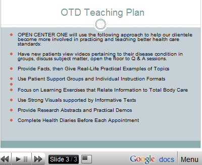
      What this means, according to the ILS developers, Richard M. Felder, Linda K. Silverman, and Barbara A. Soloman of North Carolina State University, is that my design should be designed to appeal to users who learn in the following manner: Due to their higher scorees on global and intuitive processing, their positive score on active learning versus reflective learning and their equal use of visual and verbal learning styles, my users are thus more capable of learning by doing, of interacting directly with the any information or material that is presented to them. They can do this through hands-on experience, discussion, or by teaching or explaining the relevant concepts to others. In my site development for my project, I included a plan to have the users of my proposed services work in groups, discuss the material under review with the lecturers who were presenting the information, as well as with with other group members in support groups. I developed a plan to have the staff present the information using research and factual data that then is related to real-life situations in order to make concrete examples of the ideas under discussion:

      (See the lay-out for the teaching plan that is developed for active learners who learn using visual and text-based information)>


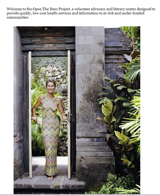
      Because my target audience has an almost equal ability to learn using visual and written material, I tried to evenly distribute the information that I was presenting using both styles in my design. Throughout my site development process, I tried different layouts and constructs to appeal to my core audience, such as pictures of healthy, vibrant people who promote the idea of health and wellness. One of my earlier designs used the title of my company "OPEN THE DOOR" to better health, with a visual of a woman walking through a doorway to reinforce this idea on an intuitive level: See image>


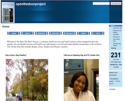
      After review, however, I felt that my audience would respond better to real-life people who are already involved in improving the lives of themselves and others through promoting better health, rather than to a woman who looks as though she is walking out of a spa, so I changed that page of my site to include bicyclists riding up a hill and a picture of a respected colleague, Natasha, a clinical scientist who is dedicated to creating better health care outcomes for others, and who is also interested in developing the OPEN project in concrete form>


      On the Learning styles test, my target audience also scored higher on intuitive and global learning style preferences, indicating that they will learn more effectively using a "big-picture" approach towards understanding a concept versus a step-by-step method. Because intuitive learners enjoy the use of novel and innovative approaches to learning, rather than the "tried and true" techniques that involve repetition and rote learning, so I designed the entire website using a global, intuitive format, achieved (hopefully) by including descriptions of the project on each page of the design, by providing several pages of supporting information on health care issues to allow the users to develop a view of the issues in totality. By giving the users the overall concept of the program, before listing specific services, I felt that they would get a better grasp of what the center hopes to accomplish with its work.

      See an early example and a finished screen-shot from the website>

      Early Version: Final Version:


      Another element I included in my design was the use of videos and tutorials to reinforce particularly important lessons. This type of format should be useful to a group who needs a global overview of a problem, who learn intuitively, and allow the viewer to stop, rewind, and review the videos and tutorials until they have absorbed the lesson. Here is an screen-shot from my video page:


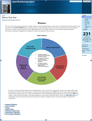
      Trying to incorporate specific learning preferences into a consolidated web design was an interesting experience, although it felt a little awkward at first. In considering a design not as what I find personally appealing, but rather from the potential appeal to a particular audience, I really found that I liked structuring a solution to problem in this way. Using learning styles as focal points help to add structure to the thought process during the development of a website. I developed most of my site content off-line before I started playing with the visual design of the site. I tried many themes, versions, layouts and data structures before I settled on the final version, which consists of a basic blue and white color scheme. In designing the site, my intenton was to present the information I wanted to convey in a way that would allow the reader to intuitively grasp the interlinked concepts, rather than leading the reader through a step-by-step description. To give you, the reader, an idea of the visual effect of my site, please see the pages below, presented in sequence:


      I hoped you have enjoyed this process review. I would really like to know how all styles of learners feel about my site design and content, what you like, dislike, things you find effective or ineffective, etc. Please feel free to share your thoughts! My finished site can be seen and enjoyed in its entirety at:
      OPEN THE DOOR: To Better Health.